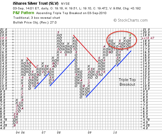
Point and figure charts are one of the oldest and purest charting methods in the field of technical analysis. Point and figure charts are not commonly studied and practiced by technicians today as in the past. However, I use it as a simple indicator of areas of supply and demand and to indicate new trends. Warren Buffett said, “There seems to be some perverse human characteristic that likes to make easy things difficult.” Especially in the field of technical analysis, analysts seem to love making complex formulas when in reality it is completely unnecessary.
Point and figure charting is a simple method of plotting price alone. It helps the chartist understand support, resistance and specific congestion areas. Congestion areas are areas of price where there was a previous battle of supply and demand. Often times when the price reaches this area it is difficult to break through. However, when the breakout does occur a major move begins. These charts are excellent at identifying specific price and relative strength breakouts.
Silver has just made a triple top breakout which signifies a possible major trend higher. Triple top buy signals are very powerful and hint at a move higher. Unlike bar charts projections are based on a horizontal count rather than vertical. This silver triple top breakout which may occur shortly could initiate a rise to $27. This target is also confirmed by the bar chart analysis which I showed on Sunday’s update. On the point and figure relative strength chart a breakout has already occurred.
Usually relative strength breakouts precede price breakouts and confirm the move higher.
Never in history has the gold to silver ratio been so high and a reversion to the mean could mean a significant move in silver.
Disclosure: Own silver and silver mining shares.


0 Responses